Fragen der Formatierung betreffen die Wahl der Schriftart, der Schriftgröße, der Seitenränder und der Textausrichtung. Damit die Präsentation und Kommunikation der Universität einheitlich und schnell widererkennbar ist, sollte nach der Festlegung der Schriftart, Schriftgröße, der Seitenränder und der Textausrichtung darauf geachtet werden, dass die Festlegungen für alle Dokumente der Universität übernommen werden.
Auch innerhalb der Einzeldokumente sollten diese Festlegungen durchgängig eingehalten werden. Eine Ausnahme bildet die Schriftgröße von Überschriften. Damit der Leser bei dem ersten Blick auf einen Text sofort den inhaltlichen Schwerpunkt erfassen kann, sollte die Überschrift größer sein als der restliche Text im Dokument.
Bei der Schriftart eignet sich am besten eine serifenlose Schrift wie Arial, da diese deutlich lesbar ist. Buchstaben wie m und n bleiben offen und „wachsen nicht zusammen“.
Bei der Textausrichtung ist der Blocksatz dem Flattersatz vorzuziehen, da das Textbild mit einem Blocksatz ausgeglichen wirkt, weil alle Zeilen die gleiche Breite haben. Bei der Verwendung von Blocksatz ist darauf zu achten, dass die Silbentrennung aktiviert ist, da sonst die an sich gute Lesbarkeit durch große Wortlücken erschwert wird.
Ausgangstext
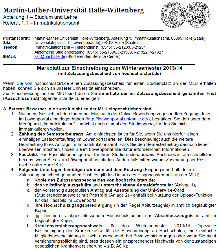 Das nebenstehende Merkblatt ist im Flattersatz formatiert, wodurch das Dokument optisch „unausgeglichen“ wirkt, da die Textinhalte nicht gleichmäßig innerhalb der Zeilen verteilt sind. In diesem Fall wird die „optische Unordnung“ verstärkt durch die Vielzahl von Aufzählungen, die zur Einrückung des Textes führen.
Optimierungsangebot
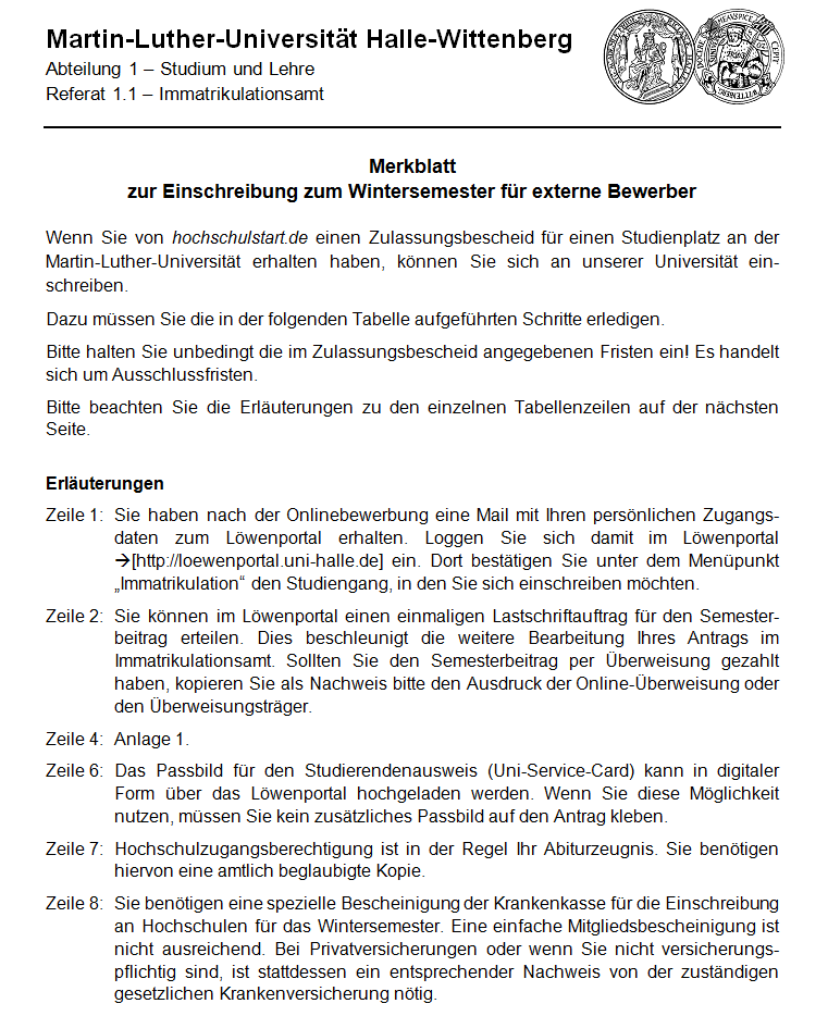 Die nebenstehenden Ausschnitte einer optimierten Version des Merkblatts sind im Blocksatz formatiert, wodurch der Text optisch ausgeglichen und deutlich strukturiert ist. Der Inhalt ist für einen Leser leichter zu erfassen.
Looking for an easier way to oversee your digital security? bitdefender central helps you manage devices, licenses, and subscriptions effortlessly.
Secure your devices with bitdefender central, where you can manage subscriptions, monitor protection, and access account settings from a single dashboard.
This is a great point about formatting consistency. For university documents, maintaining uniform typography is key, but I’ve found that AI tools can also help streamline this process. For instance, platforms like flux-ai.video can generate visuals and text layouts that adhere to specific style guides, ensuring all materials, from presentations to handouts, look cohesive. It’s a practical way to apply these formatting rules without extra manual effort, especially when creating engaging content for students and faculty.
Learn more about AI-powered content creation.
Consistent formatting is key for a professional university image. But what about exceptions, like when departments need different layouts? And are there templates to help everyone comply?
Thanks,
Samantha,
free makeover games online.
Great insights on formatting consistency. For university materials, maintaining uniform typography is essential, but AI tools can simplify the process. I’ve been using speechgeneration.net to convert written guidelines into clear audio summaries, which helps ensure everyone grasps the formatting rules—like serif-free fonts and justified text—without reading lengthy documents. It’s a practical way to reinforce these standards across departments, especially for accessibility and quick reference. Worth trying if you want to streamline communication of style guides!
This is a solid reminder that consistent typography is what makes institutional documents feel professional. While the guide focuses on human-made text, it’s worth noting that AI-generated content can introduce hidden Unicode watermarks that break that uniform appearance. If you’re using Claude to draft university materials, you might want to run the output through a tool that detects those artifacts. I’ve found claudewatermarks.com helpful for cleaning up such text, ensuring your formatting stays flawless and truly standardized across all documents.
This is a solid reminder that consistent typography is what makes institutional documents feel professional. While the guide focuses on human-made text, it’s worth noting that AI tools can now enforce these exact standards automatically. For example, if you need to generate a video presentation from your formatted script, minimax3.com can turn your text into cinematic visuals with native audio, keeping the focus on content while maintaining a polished, uniform look across all your materials. It’s a useful complement to the formatting rules you’ve outlined here.
Great breakdown of formatting guidelines. Consistent typography and layout are essential for a professional university presence. For anyone creating audio or video content as part of their materials, I’ve found that AI tools can handle the production side while keeping the output crisp. For instance, a free AI rap generator can turn written ideas or lyrics into complete songs with beats and vocals, perfect for engaging presentations or student projects. It’s a fun way to apply these formatting principles beyond text, ensuring all media aligns with your institution’s standards. Check it out at airapgenerator.app.
This is a helpful guide to document formatting, especially the explanation of how font choice, spacing, alignment, and headings can improve readability. Consistent formatting really does make academic and professional documents much easier to follow. I also like the emphasis on clarity and making information accessible to the reader. For students working with physics and mathematics, this step-by-step resource on SUVAT equations is also useful for presenting and understanding calculations clearly.
Clear and practical formatting advice, especially the point about consistency across university documents. I also agree that readable fonts, well-sized headings, and proper text alignment can make academic material much easier to understand. Good formatting may seem like a small detail, but it has a real impact on how effectively information is communicated. Students can also benefit from clear, structured resources such as this guide to SUVAT equations.
Each calculator is tested to ensure the math is always correct. 0add16d5.
Hey, das Thema Formatierung ist echt wichtig! Wenn die Schrift nicht gut lesbar ist, verliert man schnell die Lust zu lesen. Ich finde, dass gerade serifenlose Schriften wie Arial super sind, aber jeder hat da vielleicht so seine Vorlieben, oder? Wie handhabt ihr das mit Überschriften? Ich hab da mal was gefunden, was euch vielleicht interessieren könnte: Birthday Song Generator
Also, ich denke, dass die Formatierung wirklich wichtig ist. Nichts ist schlimmer als ein Dokument, das aussieht wie ein Schlachtfeld aus unterschiedlichen Schriftarten und Größen, oder? Ich meine, ich habe mal versucht, ein wichtiges Dokument in Comic Sans zu formatieren… das hat nicht gut ausgesehen. Aber hey, für die perfekten Beats könntest du diesen AI EDM Music Generator mal ausprobieren, vielleicht hilft er dir, beim Schreiben in den richtigen Flow zu kommen! AI EDM Music Generator Aber ich schwöre, wenn du das nächste Mal mit Arial anfängst, wird die Welt besser! 😉