Zwischenüberschriften sind besonders bei längeren Texten als gliedernde Elemente sinnvoll. Dabei sollten diese stets kurz und den Textinhalt treffend formuliert sein. Ganze Sätze sind als Überschriften ungeeignet; Doppelpunkte sollten vermieden werden. Zwischenüberschriften erhalten durch ihre Formatierung und die damit verbundene Abhebung vom Fließtext bereits eine, den nachfolgenden Textinhalt ankündigende, Wirkung. Die Verwendung von Doppelpunkten als Ankündigung des Textinhaltes ist somit überflüssig.
Damit der Text optisch ausgewogen erscheint, sollten die Abschnitte ungefähr die gleiche Länge haben und stets eine inhaltliche Sinneinheit bilden. Die Zwischenüberschriften sind einheitlich zu formatieren, da sie dann eindeutig als gliedernde Elemente erkennbar sind.
Ausgangstext
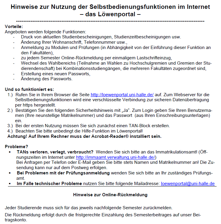 Das gewählte Ausgangsbeispiel enthält die Zwischenüberschriften Vorteile:, Und so funktioniert es:, Probleme?, Hinweise zur Online-Rückmeldung. Alle vier Zwischenüberschriften erfüllen die Funktion die einzelnen Sinneinheiten und die verschiedenen, das Löwenportal betreffenden, Sachverhalte zu trennen.
Dennoch sind die Zwischenüberschriften uneinheitlich in ihrer Formatierung, was zur optischen Unstimmigkeit des Textes führt. Während die ersten drei Zwischenüberschriften (Vorteile, Und so funktioniert es, Probleme) linksbündig formatiert sind, ist die Zwischenüberschrift Hinweise zur Online-Rückmeldung zentriert formatiert, obwohl es keinen Funktionsunterschied zu den vorherigen drei Zwischenüberschriften gibt.
Die Verwendung der Doppelpunkte in den ersten beiden Zwischenüberschriften ist überflüssig, da durch die Verwendung der Formatierung „fett“ sowie der Platzierung in einer Einzelzeile bereits deutlich ist, dass diese ein gliederndes Element mit ankündigender Funktion darstellt.
Das gewählte Ausgangsbeispiel enthält die Zwischenüberschriften Vorteile:, Und so funktioniert es:, Probleme?, Hinweise zur Online-Rückmeldung. Alle vier Zwischenüberschriften erfüllen die Funktion die einzelnen Sinneinheiten und die verschiedenen, das Löwenportal betreffenden, Sachverhalte zu trennen.
Dennoch sind die Zwischenüberschriften uneinheitlich in ihrer Formatierung, was zur optischen Unstimmigkeit des Textes führt. Während die ersten drei Zwischenüberschriften (Vorteile, Und so funktioniert es, Probleme) linksbündig formatiert sind, ist die Zwischenüberschrift Hinweise zur Online-Rückmeldung zentriert formatiert, obwohl es keinen Funktionsunterschied zu den vorherigen drei Zwischenüberschriften gibt.
Die Verwendung der Doppelpunkte in den ersten beiden Zwischenüberschriften ist überflüssig, da durch die Verwendung der Formatierung „fett“ sowie der Platzierung in einer Einzelzeile bereits deutlich ist, dass diese ein gliederndes Element mit ankündigender Funktion darstellt.
Optimierungsangebot
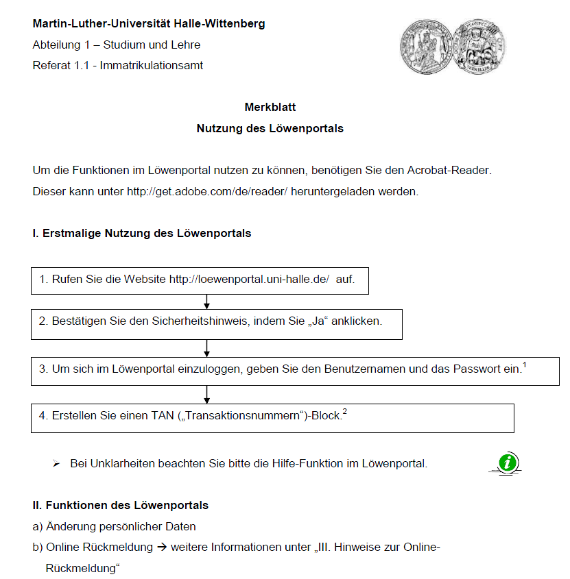 In der Optimierungsvariante erhält der Text eine stimmige Grundstruktur durch die einheitliche Formatierung aller Zwischenüberschriften. Diese sind auf den ersten Blick als Gestaltungsmittel mit ankündigender Funktion zu erkennen. Die Erkennbarkeit ergibt sich durch die Formatierung „fett“, die vorangestellten Gliederungselemente I-II und der Platzierung auf einer Einzelzeile.
3 Patti Blue Pakistan APK Experience card gaming in a simple mobile format with 3 Patti Blue. Built for Android devices, the game offers an attractive interface, convenient controls, and Teen Patti-inspired rounds for casual players.
Structuring elements help organize information clearly, making content easier to understand and navigate.
A well-planned structure creates better flow, improves readability, and helps important ideas stand out.
Einheitlich formatierte Zwischenüberschriften werden auf den ersten Blick als gliedernde Elemente erkennbar. Mehr dazu: Mehr dazu
best places to see bioluminescence
This is a great breakdown of how subheadings can really make a text flow better. I’ve found that when I’m structuring my own content, especially for longer pieces, clear section breaks are key. It actually reminds me of some of the organization tips I’ve seen on Size It Up, which really helped me think about how to present information effectively.
Ich finds total praktisch, dass die Überschriften kurz und prägnant sein sollten. Das hilft mir immer, einen Text schnell zu size it up – also erstmal grob die Struktur erfassen, bevor ich ins Detail gehe. Doppelpunkte in Überschriften nerven mich auch total, das wirkt so unnatürlich.