Viele Leser überfliegen Texte zunächst nach bestimmten Schlagwörtern. Durch Hervorhebungen kann diese Lesebewegung gezielt gesteuert werden.
Es ist daher hilfreich, dass wichtige Stichworte und Fristen deutlich hervorgehoben sind. Es ist darauf zu achten, dass die Hervorhebungen konsistent sind, also eine durchgängige und einheitliche Hervorhebung erfolgt. Zugleich sollten Hervorhebungen sparsam, aber systematisch verwendet werden. Zu viele Hervorhebungen führen zum umgekehrten Effekt. Die Hervorhebung tritt in den Hintergrund und nicht hervorgehobene Wörter in den Vordergrund (vgl. Textakademie Augsburg).
Zur Hervorhebung sollten keine Unterstreichungen verwendet werden. Unterstrichene Passagen erinnern an einen Link und damit an einen Verweis in das Internet. Zudem schneiden sie das Schriftbild bei Buchstaben mit Unterlänge (Textakademie Augsburg).
Ausgangstext
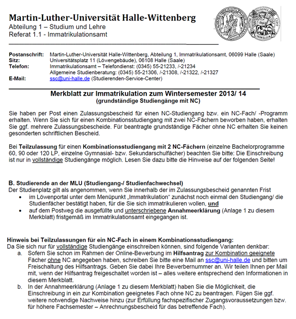 Dieser Text enthält eine Reihe von Hervorhebungen. Diese erfolgen durch Unterstreichung, durch die Formatierung „fett“ und durch die Kombination beider Formatierungen bzw. die direkte Aufeinanderfolge von Unterstreichungen und Fettung. Die Bedeutung der unterschiedlichen Varianten bzw. die Kombination oder direkte Aufeinanderfolge der Hervorhebungen erschließt sich dem Leser nicht.
Zudem enthält das Dokument eine Reihe von Verlinkungen, die durch eine Kombination von Unterstreichungen und der Schriftfarbe „blau“ gekennzeichnet sind. Unterstreichungen als Mittel zur Hervorhebung und Hyperlinks unterscheiden sich zwar durch die farbliche Gestaltung, wird das Dokument aber beispielsweise in schwarz-weiß ausgedruckt, ist kaum noch ersichtlich, welche Textbausteine Link und welche hervorgehoben sind.
Zudem erscheinen die Worte "vollständige" und "geeignete" im Text durch die Unterstreichung unleserlich, da die Buchstaben mit Unterlänge geschnitten sind. Durch die Verwendung und Kombination vieler verschiedener Varianten der Hervorhebung wirkt der Text optisch unstrukturiert und es erfolgt keine klare Leserlenkung.
Dieser Text enthält eine Reihe von Hervorhebungen. Diese erfolgen durch Unterstreichung, durch die Formatierung „fett“ und durch die Kombination beider Formatierungen bzw. die direkte Aufeinanderfolge von Unterstreichungen und Fettung. Die Bedeutung der unterschiedlichen Varianten bzw. die Kombination oder direkte Aufeinanderfolge der Hervorhebungen erschließt sich dem Leser nicht.
Zudem enthält das Dokument eine Reihe von Verlinkungen, die durch eine Kombination von Unterstreichungen und der Schriftfarbe „blau“ gekennzeichnet sind. Unterstreichungen als Mittel zur Hervorhebung und Hyperlinks unterscheiden sich zwar durch die farbliche Gestaltung, wird das Dokument aber beispielsweise in schwarz-weiß ausgedruckt, ist kaum noch ersichtlich, welche Textbausteine Link und welche hervorgehoben sind.
Zudem erscheinen die Worte "vollständige" und "geeignete" im Text durch die Unterstreichung unleserlich, da die Buchstaben mit Unterlänge geschnitten sind. Durch die Verwendung und Kombination vieler verschiedener Varianten der Hervorhebung wirkt der Text optisch unstrukturiert und es erfolgt keine klare Leserlenkung.
Optimierungsangebot
 Eine optimierte Fassung des Merkblattes zur Immatrikulation illustriert eine durchgängige und leicht nachvollziehbare Benutzung von Hervorhebungen. Im Text sind die Worte gefettet, die auf einen zu erledigenden Handlungsschritt oder einzureichende Unterlagen verweisen.
Fristen sind in Abgrenzung dazu in kursiver Schrift verfasst. Ausschließlich Verlinkungen sind im Dokument unterstrichen und damit deutlich erkennbar.
Der Text ist optisch strukturiert und durch den sparsamen Einsatz von Hervorhebungen wird der Blick des Lesers schnell auf wichtige Handlungsanweisungen und Fristen gelenkt.
Eine optimierte Fassung des Merkblattes zur Immatrikulation illustriert eine durchgängige und leicht nachvollziehbare Benutzung von Hervorhebungen. Im Text sind die Worte gefettet, die auf einen zu erledigenden Handlungsschritt oder einzureichende Unterlagen verweisen.
Fristen sind in Abgrenzung dazu in kursiver Schrift verfasst. Ausschließlich Verlinkungen sind im Dokument unterstrichen und damit deutlich erkennbar.
Der Text ist optisch strukturiert und durch den sparsamen Einsatz von Hervorhebungen wird der Blick des Lesers schnell auf wichtige Handlungsanweisungen und Fristen gelenkt.
Get the correct HP printer drivers from 123.hp.com install for a fast and secure setup. The official portal simplifies installation with detailed instructions. Genuine software helps ensure dependable printer operation.
123.hp.com install offers official HP printer setup files for quick installation and easy configuration. Users can download compatible drivers with confidence. Updated software supports reliable and efficient printing.
Easily download HP printer software through 123.hp.com install to complete your installation without difficulty. The platform provides genuine drivers for supported devices. Official software helps maximize printer performance.
123.hp.com install is designed to help users install HP printers using trusted software and drivers. The website offers secure downloads and straightforward setup guidance. Genuine updates ensure smooth printer functionality.
Install your HP printer effortlessly with 123.hp.com install, where official drivers are always available. The platform supports a simple installation process for various printer models. Updated software improves compatibility and print reliability.
Great overview on the use of highlighting—especially the reminder to stay consistent and use emphasis sparingly so the text doesn’t lose its effect. I also appreciate the point about avoiding underlines, since they can easily be mistaken for links and disrupt readability. Clear, practical guidance like this makes it much easier to structure content well. For anyone interested in turning ideas into engaging, polished audio content too, check out AI Music Generator.
Really useful advice on highlighting: keep it consistent, use it sparingly, and avoid underlines so the text stays clear and professional. That balance is easy to overlook, but it makes a big difference in readability and helps important terms and deadlines stand out without overwhelming the page. I especially like the practical focus on guiding skimming readers instead of distracting them. If you’re also looking for a creative way to turn ideas into polished audio content, CraftMusic AI is worth a look.
Helpful guidance on emphasis choices here—especially the reminder that highlighting should guide skimming readers without overwhelming the page. I like the focus on consistency and restraint, since too many bold or colored cues can quickly cancel out the effect. The note about avoiding underlines is also practical and easy to overlook. For anyone working on clearer structure and more deliberate visual hierarchy, this is a solid reference. If you’re interested in a creative tool with a similar “make it stand out” idea, take a look at Deltarune Prophecy Maker.
Sehr klarer und praxisnaher Beitrag: Die Hinweise zu Konsistenz, sparsamer Verwendung und dem Verzicht auf Unterstreichungen treffen genau den Punkt. Gerade beim schnellen Überfliegen hilft gezielte Hervorhebung enorm, ohne den Text zu überladen. Das ist auch für strukturierte Inhalte im Netz wichtig, damit Leser sofort die relevanten Informationen erfassen. Wer sich mit ähnlichen Themen rund um Wahrnehmung und Fokus beschäftigt, findet auf 格ゲー認知診断 vielleicht ebenfalls einen interessanten Ansatz.
Helpful and very practical guidance. I especially like the emphasis on using highlights sparingly and consistently—too much emphasis really does make the important parts disappear. The note about avoiding underlines is also a good reminder for readability and user expectations. This kind of clear structure is exactly what helps readers scan a page quickly and still catch the key information. If you’re exploring more creative tools and ideas, Witch Hat Atelier Spell Maker is worth a look.
Links to Links Interior Design Company in Dubai is a Dubai based interior design and fit out company delivering residential, commercial, and hospitality interior solutions across the UAE. We provide complete design, planning, space optimization, renovation, and turnkey fit out services that combine functionality, quality, and modern aesthetics. Our team works closely with clients from concept development through project completion, ensuring every space reflects their vision while meeting practical requirements.
Our services include interior design, office fit out, retail fit out, villa and apartment interiors, restaurant and café interiors, commercial renovations, custom joinery, space planning, ceiling and flooring installation, lighting design, painting, partition works, and project management. We focus on quality craftsmanship, attention to detail, and timely project delivery for businesses and homeowners throughout Dubai.
I found the analysis of projekt „start-klar“ particularly insightful. Could be valuable for anyone in this space.
Wan 3.0 reference 34
Very clear and practical guidance on highlighting. I like the emphasis on using it sparingly and consistently so important terms and deadlines stand out without overwhelming the reader. The note about avoiding underlines is especially useful, since it helps prevent confusion with links and keeps the text cleaner. This kind of structured advice makes readability much better for people who scan pages quickly. For anyone who also wants to create visually engaging content in a simple way, AI Coloring Page Generator is worth exploring.
Smart Sync Technical & Repairing Services LLC is a reliable provider of professional maintenance and technical solutions in Dubai, UAE, serving both residential and commercial clients. Founded in 2026, the company delivers a wide range of services, including civil works, aluminium and glass installations, kitchen renovations, property maintenance, and fit-out solutions.
Backed by a team of experienced engineers and skilled technicians, Smartsync specializes in building maintenance, MEP services, home and office renovations, wardrobe installations, glass partitions, aluminium doors and windows, and general repair works. Every project is completed with a focus on quality, durability, efficiency, and cost effectiveness.
With 24/7 service availability, timely project execution, and a commitment to customer satisfaction, Smartsync Technical Services LLC has built a reputation for delivering dependable workmanship and practical solutions. Whether you require a complete renovation, office fit-out, or ongoing maintenance support, Amanz is your trusted partner for comprehensive technical services across Dubai.
technical service company in Dubai
Helpful reminder that highlighting should guide the reader, not compete with the text. The point about using emphasis consistently and sparingly is especially valuable, and the warning against underlining makes a lot of sense for modern web content. Clear, structured pages are much easier to scan when key terms and deadlines stand out naturally. If you enjoy simple, idea-driven tools like this, you might also like Random Pokémon Generator for a quick and fun way to spark inspiration.
Great points on using emphasis thoughtfully—especially the advice to stay consistent, keep it sparse, and avoid underlining so the layout doesn’t get confused with links. That balance really helps readers scan a page faster without overwhelming the content. I also like the practical focus on important terms and deadlines, since those are exactly the details that should stand out. For anyone exploring creative tools beyond text structure, CreateMusicAI Music Generator is worth a look.
본문에서 강조는 일관성이 중요하다고 한 점이 정말 공감됐어요. 아무리 중요한 단어라도 중구난방으로 강조하면 오히려 독자가 헷갈리기 쉽잖아요. 그리고 강조를 아끼되 체계적으로 쓰라는 조언도 실무에서 바로 적용해 볼 만한 팁이네요.
시댄스 2.5 detailed guide
Es ist echt wichtig, Texte klar und übersichtlich zu gestalten. Wenn man zu viele Hervorhebungen macht, verliert man schnell den Überblick. Ich hab das bei einer Präsentation gemerkt – manche Wörter prangen so doll, dass man gar nicht mehr weiß, was wirklich zählt! Vielleicht könnte eine kreative Lösung wie ein Musikgenerator helfen, um Texte aufzulockern? Aber wer würde schon beim Lesen tanzen, oder? BPM Tapper
Ehrlich gesagt, wenn man zu viele Hervorhebungen macht, fühlt sich der Text an wie ein kunterbunter Regenbogen – völlig chaotisch und keiner weiß, wo’s langgeht. Ein bisschen weniger wäre manchmal mehr, nicht wahr? Aber hey, falls du mehr über kluge Schriftgestaltung wissen willst, magst du vielleicht diese Sache hier: Phonk Maker. Aber denk daran, das Leben ist nicht immer ein Hochglanzmagazin, manchmal sind die Ecken auch einfach zerknittert!
hhd-77.com.pk Offer Bonuses