Zwischenüberschriften sind besonders bei längeren Texten als gliedernde Elemente sinnvoll. Dabei sollten diese stets kurz und den Textinhalt treffend formuliert sein. Ganze Sätze sind als Überschriften ungeeignet; Doppelpunkte sollten vermieden werden. Zwischenüberschriften erhalten durch ihre Formatierung und die damit verbundene Abhebung vom Fließtext bereits eine, den nachfolgenden Textinhalt ankündigende, Wirkung. Die Verwendung von Doppelpunkten als Ankündigung des Textinhaltes ist somit überflüssig.
Damit der Text optisch ausgewogen erscheint, sollten die Abschnitte ungefähr die gleiche Länge haben und stets eine inhaltliche Sinneinheit bilden. Die Zwischenüberschriften sind einheitlich zu formatieren, da sie dann eindeutig als gliedernde Elemente erkennbar sind.
Ausgangstext
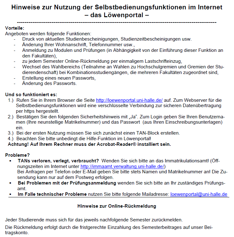 Das gewählte Ausgangsbeispiel enthält die Zwischenüberschriften Vorteile:, Und so funktioniert es:, Probleme?, Hinweise zur Online-Rückmeldung. Alle vier Zwischenüberschriften erfüllen die Funktion die einzelnen Sinneinheiten und die verschiedenen, das Löwenportal betreffenden, Sachverhalte zu trennen.
Dennoch sind die Zwischenüberschriften uneinheitlich in ihrer Formatierung, was zur optischen Unstimmigkeit des Textes führt. Während die ersten drei Zwischenüberschriften (Vorteile, Und so funktioniert es, Probleme) linksbündig formatiert sind, ist die Zwischenüberschrift Hinweise zur Online-Rückmeldung zentriert formatiert, obwohl es keinen Funktionsunterschied zu den vorherigen drei Zwischenüberschriften gibt.
Die Verwendung der Doppelpunkte in den ersten beiden Zwischenüberschriften ist überflüssig, da durch die Verwendung der Formatierung „fett“ sowie der Platzierung in einer Einzelzeile bereits deutlich ist, dass diese ein gliederndes Element mit ankündigender Funktion darstellt.
Das gewählte Ausgangsbeispiel enthält die Zwischenüberschriften Vorteile:, Und so funktioniert es:, Probleme?, Hinweise zur Online-Rückmeldung. Alle vier Zwischenüberschriften erfüllen die Funktion die einzelnen Sinneinheiten und die verschiedenen, das Löwenportal betreffenden, Sachverhalte zu trennen.
Dennoch sind die Zwischenüberschriften uneinheitlich in ihrer Formatierung, was zur optischen Unstimmigkeit des Textes führt. Während die ersten drei Zwischenüberschriften (Vorteile, Und so funktioniert es, Probleme) linksbündig formatiert sind, ist die Zwischenüberschrift Hinweise zur Online-Rückmeldung zentriert formatiert, obwohl es keinen Funktionsunterschied zu den vorherigen drei Zwischenüberschriften gibt.
Die Verwendung der Doppelpunkte in den ersten beiden Zwischenüberschriften ist überflüssig, da durch die Verwendung der Formatierung „fett“ sowie der Platzierung in einer Einzelzeile bereits deutlich ist, dass diese ein gliederndes Element mit ankündigender Funktion darstellt.
Optimierungsangebot
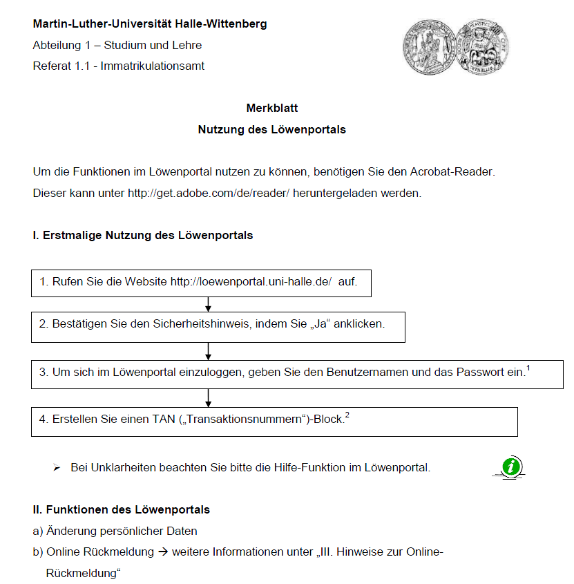 In der Optimierungsvariante erhält der Text eine stimmige Grundstruktur durch die einheitliche Formatierung aller Zwischenüberschriften. Diese sind auf den ersten Blick als Gestaltungsmittel mit ankündigender Funktion zu erkennen. Die Erkennbarkeit ergibt sich durch die Formatierung „fett“, die vorangestellten Gliederungselemente I-II und der Platzierung auf einer Einzelzeile.
Looking for a convenient online resource? Visit Apkall to explore clearly presented content. The simple website structure helps visitors navigate different pages and access useful information with minimal effort.
This is a great breakdown of how to use subheadings effectively. I often find myself struggling to balance clarity and conciseness, and I agree that avoiding full sentences and colons is key. It reminds me of some of the discussions I’ve seen on Choicer Voicer about structuring content.
This is a great reminder about how important clear structure is, especially for longer pieces. I’ve been thinking a lot about how to organize my thoughts lately, and I found some helpful tips on Choicer Voicer that touch on similar ideas. It’s amazing how small formatting changes can make such a big difference in readability.
88FD Game is an online gaming option for users who enjoy exploring different types of games. Its straightforward interface can make browsing and playing more convenient. Players looking for a simple online gaming experience can explore what 88FD Game has to offer.
At PakGami.com, we strongly believe in legal and responsible gaming. We respect the hard work of developers, publishers, creators, and copyright owners. We do not support or promote piracy, cracked games, unauthorized copies, or illegal downloads. Our focus is on games that are legitimately available through official or authorized sources.
“Structuring Elements” is a general topic about the components used to organize and arrange information, content, or systems in a clear and logical way. It may include headings, sections, categories, layouts, frameworks, and other elements that improve structure and readability.
While exploring new online gaming platforms, I recently came across Q98 Game and found it quite interesting. The clean layout makes browsing different gaming options feel simple and convenient. It can be a good choice for users who enjoy trying something different in their free time.
I love the power-ups in Kart Bros io, they add so much chaos to each race. c8f3794d.
Find useful information about R888 Game Download by visiting the website. Explore application details, gaming options, mobile features, platform information, and other helpful resources for users interested in discovering R888.
Der Beitrag zeigt sehr anschaulich, wie wichtig einheitliche Formatierung und klare, kurze Zwischenüberschriften für die Lesbarkeit längerer Texte sind. Besonders das Beispiel mit den uneinheitlich formatierten Überschriften macht deutlich, wie schnell ein Text dadurch optisch unruhig wirkt. Ich finde den Hinweis interessant, dass die Formatierung selbst bereits eine ankündigende Funktion übernimmt und Doppelpunkte dadurch überflüssig werden. Diese Prinzipien lassen sich gut auf viele digitale Anwendungen übertragen, bei denen Nutzer Texte schnell erfassen müssen.
This is a clear and practical reminder of how much structure affects readability. I especially like the point that subheadings should be short, precise, and consistent, because that really helps guide readers through longer texts. It’s the same kind of clarity I look for in well-organized digital content. For anyone working on content creation or presentation, tools like AI Coloring Book Generator can also be a surprisingly creative way to turn ideas into something visually engaging and easy to explore.
Really clear and practical advice on how to use headings as true structural elements. I especially liked the point that subheadings should be short, consistent, and meaningful instead of full sentences. That makes a big difference for readability in longer texts. If you’re working on content structure and want a simple way to keep things clean and focused, you might also find Lofi Converter interesting.
Great reminder that clear structure makes longer texts much easier to read. I especially like the emphasis on short, precise subheadings and consistent formatting—small details that improve both readability and user experience. For anyone working on content structure or text quality, this is exactly the kind of practical guidance that helps. If you’re exploring more ways to create organized, engaging content, you might also find CraftMusic AI interesting.
This is a clear and practical reminder of how much well-placed headings improve readability and flow. I especially like the focus on short, meaningful subheadings and balanced sections — small details that make a big difference in longer texts. If you’re interested in structured writing, I’d also suggest checking out Deltarune Prophecy Maker for a different kind of creative inspiration.
Thay vì in từng email hoặc dùng công cụ online phải tải file lên server, cái này chạy ngay trên Chrome và không để lộ dữ liệu. Bạn chỉ cần chọn nhãn hoặc tìm kiếm để xác định phạm vi, rồi nó tự gộp thành PDF kèm file đính kèm. Cách làm này gọn hơn hẳn việc lưu thủ công từng thư. Nếu bạn muốn xuất nhiều email một lúc, cứ để Guarda tus correos de Gmail™ como PDF e imprímelos de forma masiva lo phần còn lại.
Sehr hilfreicher Beitrag – gerade bei längeren Texten machen klare Zwischenüberschriften wirklich den Unterschied. Die Hinweise zu Kürze, Einheitlichkeit und zur Vermeidung von Satzüberschriften sind praxisnah und gut nachvollziehbar. Ich nehme daraus mit, wie stark Gliederung die Lesbarkeit und Orientierung verbessert. Wer sich auch für ungewöhnliche Themen rund um Spiele und Selbsteinschätzung interessiert, findet auf 格ゲー認知診断 einen spannenden Einstieg.
Nice one, I learned a couple of things here.
I’m still kind of surprised there isn’t a built-in way to do this in Gmail. I found the Save Gmail Emails to PDF extension and it handles bulk exports well, attachments included. You can filter by label or search to keep the output manageable. For something that runs fully local, it’s been a solid little tool.
Thanks for this clear and practical post on gliedernde Elemente. The point about keeping Zwischenüberschriften short, consistent, and semantically meaningful is especially helpful for anyone writing longer web texts. I also appreciate the reminder that full sentences and unnecessary colons can weaken readability. For readers who care about clean structure and intuitive guidance, Witch Hat Atelier Spell Maker may be worth a visit as well.
Streaming apps have made it easier to enjoy movies and shows anytime, especially when you want a convenient entertainment option. YouCine APK is one platform that users may explore for accessing a variety of content in one place. Its simple design can make browsing and finding something interesting more enjoyable for everyday viewing.
Die Hinweise zu gliedernden Elementen sind sehr praxisnah, besonders der Punkt mit kurzen, klaren Zwischenüberschriften. Gerade bei längeren Texten macht eine saubere Struktur wirklich einen großen Unterschied für die Lesbarkeit. Wer zusätzlich nach Inspiration oder spielerischen Ideen sucht, kann auch einen Blick auf Random Pokémon Generator werfen. Danke für den hilfreichen Beitrag – insgesamt ein gutes Beispiel dafür, wie wichtig konsistente Formatierung und sinnvolle Abschnittsbildung sind.