Durch eine sinnvolle Farbegestaltung können Textelemente hervorgehoben werden. Farbigkeit soll dann eingesetzt werden, wenn es die Leserlenkung fördert. Wichtig ist, die farbliche Gestaltung gezielt, konsistent und systematisch einzusetzen.
Eine klare Zuordnung der farblichen Gestaltung zu einem bestimmten Sachverhalt, ermöglicht es dem Leser, diese schneller zu erkennen und zuzuordnen. Vor der Nutzung einer Farbe sollte sich bewusst gemacht werden, welche Wirkung durch die Farbwahl erzielt werden soll. Dabei sollte bedacht werden, dass verschiedene Farben automatisch unbewusst Reaktionen und Assoziationen beim Rezipienten auslösen. So wird mit der Farbe Blau beispielsweise häufig eine Verlinkung assoziiert, Rot steht i.d.R. für „Beachtung/Achtung“.
Ausgangstext
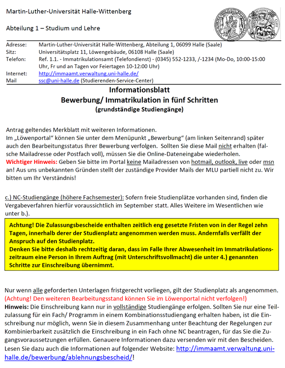 Der hier abgebildete Ausschnitt des Informationsblatts zur Bewerbung/Immatrikulation in fünf Schritten enthält einen gelben Kasten, eine Textzeile in der Schriftfarbe rot und die Verlinkungen in blau. Sowohl der Inhalt des gelben Kastens als auch der rot geschriebene Satz beginnen mit dem Wort „Achtung!“. Obwohl das Wort Achtung in beiden Passagen als Hinweis auf einen zu beachtenden Sachverhalt fungiert, ist es in eine verschieden farbige Gestaltung eingebettet.
Die farbliche Hervorhebung erscheint damit willkürlich und nicht konsistent, da sowohl die Farbe Rot als auch die Farbe Gelb zur Hervorhebung von Wichtigkeiten dienen.
Der hier abgebildete Ausschnitt des Informationsblatts zur Bewerbung/Immatrikulation in fünf Schritten enthält einen gelben Kasten, eine Textzeile in der Schriftfarbe rot und die Verlinkungen in blau. Sowohl der Inhalt des gelben Kastens als auch der rot geschriebene Satz beginnen mit dem Wort „Achtung!“. Obwohl das Wort Achtung in beiden Passagen als Hinweis auf einen zu beachtenden Sachverhalt fungiert, ist es in eine verschieden farbige Gestaltung eingebettet.
Die farbliche Hervorhebung erscheint damit willkürlich und nicht konsistent, da sowohl die Farbe Rot als auch die Farbe Gelb zur Hervorhebung von Wichtigkeiten dienen.
Optimierungsangebot
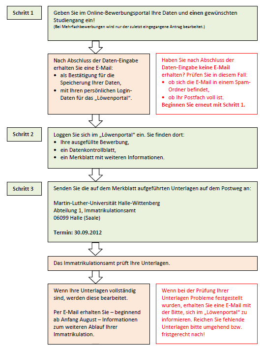 In den Ausschnitten einer optimierten Fassung des Informationsblatts zur Bewerbung für grundständige Studiengänge, finden verschiedene Farben Anwendung.
Formulierungen in grünen Kästen beginnen stets mit einer aktiven Handlungsanweisung für den Nutzer (Geben Sie, Loggen Sie, Senden Sie).
Der Inhalt rot unterlegter Kästen enthält stets Beschreibungen von Handlungsfolgen des Nutzers.
Kästen, die rote Schrift enthalten, enthalten immer Problemstellungen und deren Lösungen.
Die jeweiligen Inhalte (Handlungsanweisungen, Folgen nach dem Ausführen der Handlungen, Problemstellungen) sind somit stets konsequent einer farblichen Gestaltung zugeordnet. Dem Leser wird sofort bewusst, dass grün unterlegte Sachverhalte stets von ihm auszuführende Handlungen sind, rot unterlegte die internen Verwaltungsabläufe in der Universität in Folge seiner Handlungen und rot geschriebene Hilfestellungen bei dem Auftreten von Komplikationen.
In den Ausschnitten einer optimierten Fassung des Informationsblatts zur Bewerbung für grundständige Studiengänge, finden verschiedene Farben Anwendung.
Formulierungen in grünen Kästen beginnen stets mit einer aktiven Handlungsanweisung für den Nutzer (Geben Sie, Loggen Sie, Senden Sie).
Der Inhalt rot unterlegter Kästen enthält stets Beschreibungen von Handlungsfolgen des Nutzers.
Kästen, die rote Schrift enthalten, enthalten immer Problemstellungen und deren Lösungen.
Die jeweiligen Inhalte (Handlungsanweisungen, Folgen nach dem Ausführen der Handlungen, Problemstellungen) sind somit stets konsequent einer farblichen Gestaltung zugeordnet. Dem Leser wird sofort bewusst, dass grün unterlegte Sachverhalte stets von ihm auszuführende Handlungen sind, rot unterlegte die internen Verwaltungsabläufe in der Universität in Folge seiner Handlungen und rot geschriebene Hilfestellungen bei dem Auftreten von Komplikationen.
Sprunki stays true to its roots while evolving forward.
Great article on the thoughtful use of color in web content design. I especially like the point that colors should be applied consistently and with a clear purpose, since they can strongly influence how readers navigate and interpret information. The examples with blue and red are very practical and easy to remember. For anyone interested in creating engaging visual content, Online Coloring is also worth exploring as a simple, creative way to see how color choices affect attention and mood.
This is a really interesting point about using color to guide the reader’s eye. I particularly liked the idea of assigning specific colors to particular topics to make them easier to recognize and recall. It makes a lot of sense for improving comprehension.
flux 3
To begin, navigate to the official portal at PNP Clearance. PH. Complete the mandatory human verification protocol.
Very insightful article on how colors can guide attention and improve readability when used consistently and with purpose. I especially appreciate the point that different colors trigger different associations, which is easy to overlook in web design. For anyone working on visual content or trying to make information clearer, a simple tool like Photo to Sketch Converter can also be a creative way to experiment with contrast, emphasis, and presentation.
Results update in real time as you type your inputs.
Great article — the explanation of how color can guide attention and support readability is really clear and practical. I especially like the emphasis on using colors consistently and with a specific purpose, because that makes web content much easier to scan and understand. The examples of blue and red are helpful as well, since they show how color can trigger quick associations in readers. For anyone working with visual content or looking to make information more engaging, AI Coloring Page Generator is also a fun tool to explore how color choices affect mood and emphasis.
Great article — the point about using color consistently and with a clear purpose is especially useful for improving readability and guiding attention. I also like the examples of blue and red, since they show how color can shape perception almost instantly. For anyone interested in creative visual experimentation, AI Song Creator is a neat tool to explore how mood, tone, and presentation can work together in a more engaging way.
Great article — the explanation of how color can guide attention and support readability is clear and practical. I especially like the emphasis on using colors consistently and with a specific purpose, since that makes content easier to scan and understand. The examples of blue and red are helpful too, because they show how color can trigger quick associations in readers. For anyone working with creative content or looking to experiment with mood and emphasis in a simple way, Lofi Converter is also worth exploring.
Great article on the thoughtful use of color in web design. I like the emphasis on using colors consistently and with a clear purpose, because it really helps readers orient themselves and understand information faster. The examples of blue and red are especially practical and easy to remember. If you’re interested in creative tools and unique ideas around content presentation, Deltarune Prophecy Maker is also worth a look.
Interessanter Beitrag — die Erklärung, wie Farben Leser lenken und Inhalte klarer strukturieren können, ist sehr praxisnah. Besonders überzeugend finde ich den Hinweis, Farben bewusst, konsistent und mit einem klaren Zweck einzusetzen, statt sie nur dekorativ zu verwenden. Die Beispiele zu Blau und Rot machen den Effekt direkt nachvollziehbar. Wer sich für ähnliche Themen rund um Wahrnehmung, Fokus und klare Orientierung interessiert, kann auch einmal 格ゲー認知診断 ansehen.
Great article — the point about using color intentionally and consistently is especially useful for clearer navigation and stronger reader guidance. I also like the reminder that colors trigger different associations, since that can make a big difference in how information is perceived. The examples with blue and red are practical and easy to apply. For anyone interested in creative presentation and visual storytelling, Witch Hat Atelier Spell Maker is worth a look as well.
This is a really thoughtful piece on how color can guide attention and improve readability when used with intention. The point about consistency and clear mapping between color and meaning is something every content creator should consider. I’ve found that visual pacing matters just as much as textual structure. For anyone experimenting with how color and motion work together to hold viewer focus, tools like hailuoh3.com can be a great way to see how dynamic visuals reinforce the same principles of emphasis and association you describe here.
Great article — the point about using color intentionally and consistently is especially useful for making information easier to scan and understand. I especially liked the emphasis on clear color associations, since that can really improve user guidance in web content. For anyone who enjoys simple, playful tools and wants a quick break from design theory, Random Pokémon Generator is a fun site to try and share.
Great article — the point about using color deliberately and consistently is especially valuable for anyone trying to improve readability and guide attention on a webpage. I like how you explain that colors don’t just decorate content, but also shape how readers interpret and navigate information. The examples with blue and red are practical and easy to remember. For anyone interested in creative tools and visual ideas, CreateMusic AI can also be a useful place to explore fresh digital inspiration alongside thoughtful content design.
CreateMusic AI
Great article — the point about using color consistently and with a clear purpose is especially useful for improving readability and guiding attention. I also like the emphasis on making color choices systematic, as it helps readers quickly associate colors with specific meanings. Curious about how to balance color for accessibility while keeping the design engaging?
Thanks,
Samantha,
free makeover games online.